monday.com Dashboard Not Showing Data: 7 Causes and How to Fix Each One
Your dashboard looks fine on your end. Your colleague sees blanks. Or the numbers are just wrong. Here’s exactly why it happens and how to fix it.
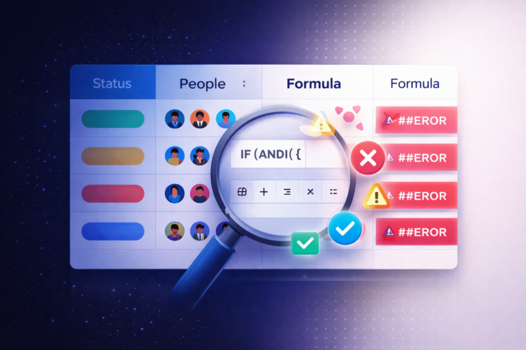
Your monday.com dashboard not showing data is one of the most disorienting problems on the platform because the fix is never obvious from inside the dashboard itself. The data exists on your boards. The widgets look fine structurally. But something is blocking the connection between the two. In our experience doing monday.com consulting for teams across industries, there are exactly seven root causes, and every one of them has a clear, specific fix. This guide covers all seven.
Why monday.com Dashboards Lose Data
Dashboards in monday.com don’t store data themselves. They pull it live from whatever boards you’ve connected. That means any misconfiguration between the dashboard and the source board can silently break the display without showing an obvious error. It also means two people looking at the same dashboard can see completely different numbers if their board access differs.
Most teams assume the dashboard is broken when the real problem is upstream: a filter, a permission gap, a column name mismatch, or a platform setting that nobody touched intentionally. Let’s work through each cause.
🔌 The Board Is Not Properly Connected
How it looks: Widgets are blank, show a “No data” message, or prompt you to “Connect a board.”
Why it happens: The most common trigger is a board that was moved to a different workspace, renamed in a way that broke an old connection, or deleted entirely. It also happens on brand new dashboards where team members assume a board is connected but it never was.
The fix: Click the board selector button in the top left corner of your dashboard (it shows the names or count of connected boards). Check that every board you expect to see data from is listed. If a board is missing, add it using the search or scroll. If a previously connected board now shows a broken link icon, the board was likely moved or deleted. Re-create the connection or restore the board.
🔍 A Filter Is Hiding Your Items
How it looks: Some data appears but counts seem lower than expected, or specific items you know exist simply don’t show up. The totals in widgets don’t match what you see on the board itself.
Why it’s tricky: monday.com dashboards have two separate filter layers, and most users only know about one of them. Missing data is usually caused by the other.
- Dashboard-level filters live in the filter bar at the top of the dashboard and apply across all widgets at once. A team member may have set a “Status = Done” filter weeks ago and forgotten about it.
- Widget-level filters live inside each widget’s settings panel (three dots in the top right of the widget, then Settings). These override dashboard-level filters and can hide entire groups or columns of data that you’d expect to see.
The fix: First, clear all dashboard-level filters by clicking the X next to any active filter in the top bar. Then open each widget’s settings and look for any filter conditions. Clear them or rebuild them intentionally. It helps to document the exact filter logic in each widget’s title or description so the next person who looks at it knows what’s excluded.
🔒 Permission Issues Are Blocking Data
How it looks: You see full data on the dashboard but a colleague sees empty widgets or a “missing access” message on some connected boards. The same dashboard looks completely different depending on who is viewing it.
Why it happens: monday.com dashboards always respect the permissions on the source boards. The dashboard itself does not override board access. There are four distinct permission layers that can each cause this:
- Private workspace: If the connected board lives in a private workspace the viewer isn’t a member of, the dashboard will show a “missing access” indicator for that board’s data.
- Private board: Boards set to “Private” are only visible to board members. Users who aren’t subscribed to the board won’t see its data in any widget, even on a shared dashboard.
- Hidden columns: If an admin has hidden a column from a specific user or user type, any widget pulling from that column will show incomplete or zero data for that person.
- Item view permissions: Boards can be set so members can only see items they’re assigned to. This means two people on the same dashboard can see very different totals from the same board.
The fix: Identify which board is causing the access gap. Have the affected user check whether they can access the source board directly. If they can’t, either add them to the board or workspace, or adjust the board’s permission level. For org-wide dashboards, using “Open” boards (visible to all account members) eliminates most permission-related data gaps. Our guide to monday.com workspace structure covers how to set up permissions that scale without creating visibility gaps.
📊 Column Mapping Is Wrong Across Boards
How it looks: Some numbers aggregate correctly, but others show as zero or blank. Your chart shows the right shape but the wrong totals. When you check the source boards individually, the data is all there.
Why it happens: When a widget is connected to multiple boards, monday.com tries to match columns by name. If your “Priority” column is named “Priority” on one board and “Task Priority” on another, the widget can’t automatically combine them. It defaults to the “All at once” view, which only aggregates columns with identical names across all connected boards and silently ignores anything that doesn’t match.
The fix: Open the widget’s settings panel. Look for the column selection area. Switch from “All at once” to “One by one” mapping. This lets you manually specify which column from each board should feed the widget. It takes a few extra minutes but it’s the only way to get accurate aggregation from boards with different column naming conventions.
This is one of the most common issues we fix during monday.com Partner on Demand engagements, especially for teams that have grown their board library organically and never standardized their column naming.
📦 Your Widget Doesn’t Support Subitems
How it looks: Your dashboard shows data from top-level items correctly, but you know certain work lives in subitems and none of it is reflected in the totals. A Number widget shows hours for parent items but ignores all subitem time estimates.
Why it happens: Not all monday.com widget types support subitem data. This is a confirmed platform limitation, not a configuration mistake. Here’s the current support matrix:
| Widget Type | Supports Subitems? |
|---|---|
| Number widget | ✅ Yes |
| Battery widget | ✅ Yes |
| Gantt widget | ✅ Yes |
| Timeline widget | ✅ Yes |
| Workload widget | ✅ Yes |
| Calendar widget | ✅ Yes |
| Chart widget | ❌ No |
| Table widget | ❌ No (top-level only) |
| Summary widget | ❌ No |
The fix: If you need to surface subitem data in your dashboard, use a Number or Battery widget rather than a Chart or Table. For time tracking or effort estimates, a Number widget pointing at a subitem’s number column is the most reliable option. If you need chart-style visualization, consider promoting key subitem data to parent items using mirror columns, then charting the parent-level data instead.
🚧 You’ve Hit the 20,000 Item Limit
How it looks: The dashboard shows a warning message about too many items. Some widgets load partially and others don’t load at all. The dashboard feels sluggish and data cuts off mid-board.
Why it happens: monday.com dashboards have a hard limit of 20,000 total items, subitems, and linked items across all connected boards combined. This limit exists for performance reasons. Once you cross it, the platform stops loading data from some boards to protect rendering speed.
The fix: You have two options. First, disconnect boards with high item counts that you don’t actually need for this specific dashboard. Second, archive completed or inactive items on your source boards to reduce their item count before reconnecting. A good habit is to run a quarterly cleanup, archiving any items with a “Done” or “Archived” status, to keep boards lean and dashboards reliable. If you need visibility across large item volumes, consider splitting into multiple purpose-specific dashboards rather than one mega-dashboard.
🔄 You’re Running the Old Dashboard Engine
How it looks: Data seems stale even after you’ve confirmed the source boards are up to date. The Refresh button doesn’t have an auto-refresh option. Some widget types that should be available aren’t showing up in the widget library.
Why it happens: monday.com has two dashboard engines: the original engine (still in use for older dashboards) and the new engine (rolled out as an upgrade). The old engine doesn’t support auto-refresh scheduling, which means your dashboard can display data that’s hours out of date unless someone manually refreshes the page.
The fix: Click the three dots (⋯) in the top right corner of your dashboard and look for “Upgrade to new dashboard engine.” The upgrade is non-destructive and takes about 30 seconds. Once upgraded, click the dropdown arrow next to the Refresh button and set your preferred auto-refresh interval. For operational dashboards used in team standups or live meetings, a 15-minute or 30-minute auto-refresh interval keeps data current without impacting performance.
🎯 Still Getting Blanks After Checking All Seven?
Some dashboard issues are buried deeper in account configuration or permission inheritance. Our certified consultants diagnose these setups every week. Let’s take a look at yours.
Book a Free Discovery Call- Confirm each source board is listed in the dashboard’s board selector
- Clear all dashboard-level filters and recheck data
- Open each widget’s settings and clear any widget-level filters
- Verify the affected user has direct access to every connected board
- Check whether any connected boards are set to Private
- Review whether any columns are hidden from the affected user’s account type
- Switch at least one widget to “One by one” column mapping and compare totals
- Check if the widget type you’re using supports subitems (see table above)
- Look for a data limit warning banner on the dashboard
- Upgrade to the new dashboard engine if the option is available
How These Issues Connect to Broader Platform Health
Most of the seven causes above are symptoms of the same underlying issue: boards and workspaces that grew without a clear structure. When columns aren’t named consistently, when boards live in the wrong workspaces, and when permission levels aren’t thought through from the start, dashboards become unreliable.
Getting your dashboards right is a lot easier when your workspace architecture is solid. If you’re seeing multiple issues at once, it’s worth reading our full guide to designing a scalable monday.com workspace structure before spending more time fixing individual widgets.
For HR teams specifically, dashboard reliability is critical. PTO balances, headcount pipeline, and compliance status all live in monday.com for many teams, and a broken dashboard creates real operational gaps. Our guide to monday.com for HR teams covers the board architecture that keeps reporting clean and accurate across the employee lifecycle.
And if you’re troubleshooting broader issues beyond dashboards, the same diagnostic approach applies to automations. The platform’s layered configuration logic is consistent across features, which is why the same teams who hit monday.com automation not triggering issues also tend to run into dashboard data gaps. Both problems usually trace back to the same permission or filter misconfiguration upstream.
If you’re managing a team on monday.com for HR, getting dashboards to show accurate headcount and process data is non-negotiable. The seven fixes above handle the vast majority of cases we see in practice.
❓ Frequently Asked Questions
🚀 Need a monday.com Expert to Fix This With You?
We’re a certified monday.com partner and we’ve diagnosed dashboard issues for teams of every size. Book a free 30-minute call and we’ll identify the root cause together.
Book Your Free Discovery Call