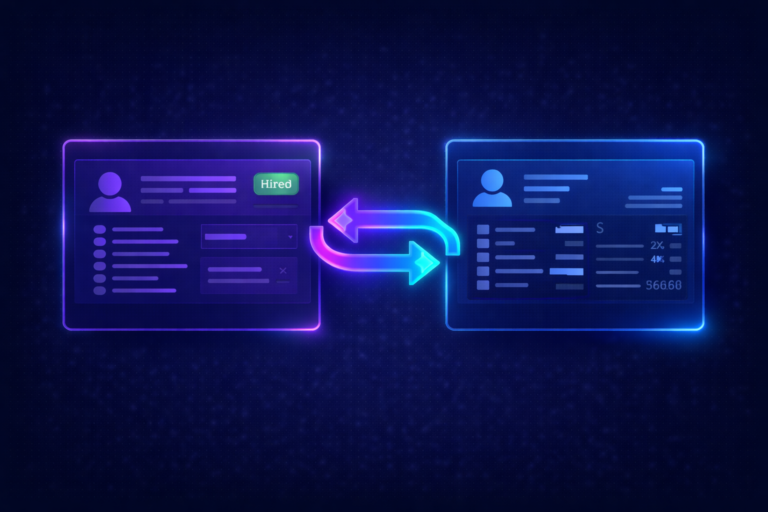
iCIMS Dashboards Every Talent Acquisition Leader Should Be Using
82% of organizations report functionality gaps in their ATS. Only 38% can show ROI on TA technology investments. In iCIMS, each user gets one dashboard, and the gap is almost always in what is on it: the data exists, but the widgets are either missing or not configured to answer the right questions.
Why Your Dashboard Is Not Working
If your leadership team is still asking “can you send me last month’s numbers?” your dashboard has failed at its core purpose. Your dashboard should answer questions before they are asked, not generate more manual work for your team.
The problem usually is not that iCIMS lacks reporting capability. It is that the dashboard was configured during implementation with generic default widgets and never revisited. Meanwhile, the questions leadership asks have evolved, the metrics that matter have shifted, and new features have launched without anyone configuring them.
Research from Aptitude Research shows that 34% of companies are increasing ATS investment, yet 82% report significant functionality gaps. Employees spend an average of 12 hours per week chasing data across disconnected systems when widgets are not configured effectively. That is time your recruiters could spend sourcing and closing candidates.
The dashboard design principle: Each iCIMS user gets one dashboard, so make every widget count. Recruiters need pipeline velocity and daily action items. Hiring managers need real-time status on their open requisitions. The C-suite needs headcount progress and diversity metrics. Same platform, different widget configurations per role.
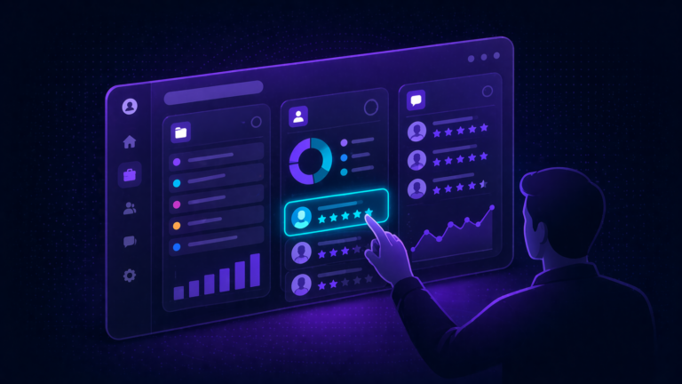
The 10 Widgets Your Dashboard Needs
In iCIMS, each user gets a single dashboard view. The key is choosing the right widgets to populate it. Click each widget below for the full breakdown: what it tracks, which metrics matter, 2025 benchmarks, and how to configure it. These are ordered by priority – start from the top and work down.
Pipeline Health Widget
This is the foundation widget. If you add nothing else to your dashboard, add this one. It shows how candidates move through your pipeline, where they stall, and where they drop off. Without it, you are managing hiring by feel instead of data.
Key Widgets
- Candidate count by status (funnel visualization)
- Conversion rate between each stage
- Average time in stage (highlights bottlenecks when dwell time spikes)
- Drop-off points by stage (where candidates exit your process)
- Pipeline velocity trend (week-over-week or month-over-month)
Configuration Tip
Set this as the default landing page for your TA leadership team. Use iCIMS dashboard panels to display the funnel alongside a “needs action” list so leaders can see both the big picture and immediate priorities in one view.
Time-to-Fill Tracker Widget
Time-to-fill is the most-requested metric from leadership, yet most teams track it as a single average number. That hides the real story. A 45-day average means nothing if engineering roles take 65 days and customer service takes 20. Break it down by department, role level, and location.
2025 Benchmarks by Industry
| Industry | Avg. Days | Trend |
|---|---|---|
| Construction | 12.7 days | Fastest |
| Healthcare | 49 days | Improving (was 67) |
| Government | 40.9 days | Stable |
| Financial Services | 40-45 days | Stable |
| Tech/Engineering | 40-50 days | Rising |
| SHRM Overall Median | 45 days | Baseline |
| National Average | 63-68 days | Jan 2026 |
AI Impact
Organizations using AI-driven recruitment tools hire 26% faster, saving approximately 11 days compared to those without AI support. If you have activated iCIMS Copilot or the Agents platform, track time-to-fill separately for AI-assisted vs. non-assisted requisitions to measure the actual impact.
Source Effectiveness Widget
Most teams know where their applications come from. Fewer know where their best hires come from. This dashboard connects source data to downstream outcomes, so you can invest in channels that produce quality, not just volume.
Key Metrics
- Applications by source (volume)
- Hires by source (conversion)
- Cost-per-hire by source
- Time-to-fill by source
- First-year retention by source (quality signal)
Referral sources consistently produce the highest-quality candidates despite representing the lowest percentage of applicants. If your referral program is not tracked in this dashboard, you are likely underinvesting in your most cost-effective channel.
Recruiter Productivity Widget
This widget answers two questions: are your recruiters overloaded, and are they effective? Without it, you are guessing at capacity and cannot make data-driven decisions about where to add headcount or redistribute work.
Key Metrics
- Open requisitions per recruiter (workload distribution)
- Hires per recruiter per month (output)
- Average time-to-fill by recruiter
- Candidate outreach volume and response rates
- Interview-to-offer ratio by recruiter
- Offer acceptance rate by recruiter
Important Context
This dashboard should support recruiters, not surveil them. Use it for capacity planning and identifying training opportunities. A recruiter with a high outreach volume but low response rate may need coaching on messaging. A recruiter with consistently long time-to-fill may be overloaded, not underperforming. Context matters.
Hiring Manager Responsiveness Widget
This is the widget most TA teams want but few configure. Hiring manager delays are one of the biggest contributors to slow time-to-fill, yet they are rarely tracked or surfaced. Used by 43% of organizations, hiring manager satisfaction is ranked the 3rd most crucial hiring metric.
Key Metrics
- Average time from interview to feedback submission
- Requisition approval turnaround time
- Interview scheduling delays (time from request to confirmed slot)
- Offer approval cycle time
- Hiring manager satisfaction score (if surveyed)
How to Use This Diplomatically
Share this data with HRBPs rather than sending it directly to hiring managers. HRBPs can use the data to have targeted conversations about where delays are costing the business candidates. Frame it as “here is where candidates are falling out of your pipeline” rather than “you are too slow.”
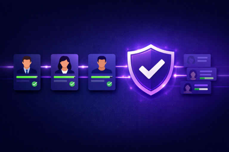
DEI Pipeline Widget
A top-of-funnel diversity number is misleading if underrepresented candidates disproportionately drop off at specific stages. This widget reveals where in your process diversity narrows, so you can address root causes rather than just sourcing volume.
Key Metrics
- Candidate demographics by funnel stage (application, screen, interview, offer, hire)
- Drop-off rates by demographic group at each stage
- Source diversity by channel (which sources bring diverse candidates?)
- Diversity of final interview slates
- Offer and acceptance rates by demographic group
65% of US companies report maintaining or increasing DEI budgets in 2025. This widget is essential for demonstrating whether that investment is producing pipeline results, not just sourcing activity.
iCIMS Configuration
Use iCIMS EEO/self-ID data collection to populate this dashboard. Ensure disposition tracking is active with reason codes at every stage so you can analyze whether diverse candidates are being screened out at specific checkpoints. The iCIMS DEI Analytics Dashboard provides customizable views for this purpose.
Offer Management Widget
Losing candidates at the offer stage is one of the most expensive failures in recruiting. Every declined offer represents sourcing, screening, and interviewing costs that produced zero return. This widget tracks where offers succeed and where they fail.
Key Metrics
- Offer acceptance rate by department, role level, and recruiter
- Time from final interview to offer extension
- Time from offer to acceptance
- Decline reasons (compensation, counter-offer, timing, role fit)
- Offer-to-start conversion (candidates who accept but never show up)
66% of applicants accept offers based on positive experiences during the hiring process. If your acceptance rate is below 80%, the issue may be candidate experience, not compensation.
Quality of Hire Widget
Quality of hire is the top priority for 34% of HR leaders, yet only 25% feel confident measuring it. The reason is that it requires connecting iCIMS data (pre-hire) to HRIS data (post-hire). This widget bridges that gap.
Pre-Hire Indicators (from iCIMS)
- Source of hire (which channels produce long-tenure employees?)
- Assessment scores and interview ratings
- Time-to-fill (rushed hires often have lower quality)
- Candidates-per-hire ratio (selectivity signal)
Post-Hire Indicators (from HRIS integration)
- First-year retention rate (17% median attrition)
- Performance review scores at 6 and 12 months
- Time-to-productivity
- Hiring manager satisfaction ratings
Configuration Requirement
This widget requires a working integration between iCIMS and your HRIS (Workday, SAP, Oracle, etc.). Ensure job codes and employee IDs map correctly so you can trace a hire from their iCIMS candidate record to their HRIS employee record. Without this link, quality of hire remains unmeasurable.
Requisition Aging Widget
Your pipeline widget shows how candidates move. A requisition aging widget shows which jobs are not moving. It is a leading indicator: if a role has been open for 45+ days with no interview activity, something is wrong and it needs attention before it becomes a 90-day crisis.
Key Metrics
- Open requisitions by age bucket (0-30, 31-60, 61-90, 90+ days)
- Requisitions exceeding SLA by department
- Requisitions with zero candidate activity in 14+ days
- Overdue interview feedback (stalled at hiring manager)
- Priority requisitions vs. standard: separate tracking
SLA Framework
Define SLA targets by role type (e.g., 30 days for hourly, 45 for professional, 60 for senior leadership). Configure iCIMS automations to flag requisitions approaching their SLA threshold so recruiters can proactively escalate rather than reactively explain why a role has been open for three months.
Career Site Performance Widget
Your career site is the top of your funnel. If it is underperforming, every downstream metric suffers. This dashboard tracks whether visitors are converting into applicants and where the experience breaks down.
Key Metrics
- Visitor-to-applicant conversion rate (target 35%+)
- Application completion rate by device (desktop vs. mobile)
- Average time to complete application
- Chatbot engagement rate (if GenAI Digital Assistant is enabled)
- Text-to-Apply conversion rate
- Top landing pages and traffic sources
60% of candidates abandon slow application processes (Josh Bersin). If your completion rate is below 60%, start by reducing application length and enabling Quick Apply before investing in more sourcing.
Widget Design Principles That Actually Work
Choosing the right widgets is only half the challenge. Arranging them so people actually use the dashboard is the other half. Research from AIHR shows that staff feel overwhelmed when a dashboard includes too much information, leading to abandonment. Here are five principles that prevent widget fatigue.
Limit to 5-7 Metrics Per View
More than seven metrics visible at once causes cognitive overload. Prioritize the widgets that drive daily action at the top, and use iCIMS panel configuration to group related metrics below the fold.
Match Cadence to Action
Daily views for recruiters (pipeline, tasks). Weekly for TA leaders (bottlenecks, aging). Monthly for executives (trends, costs, quality). If you show daily data to the C-suite, they will micromanage.
Lead with the Exception
Highlight what needs attention, not what is on track. Red/yellow/green indicators on SLA breaches, stalled requisitions, and declining acceptance rates drive action faster than trend lines.
Every Metric Needs a “So What”
If a metric cannot answer “what should I do about this?” it is a vanity metric. Total applications is vanity. Applications by source with cost-per-hire is actionable.
Set It as the Default View
Configure iCIMS so that each user role sees their relevant dashboard immediately upon login. If people have to navigate to find it, they will not use it. Make it the first thing they see.
Dashboard Widget Audit Checklist
Use this checklist to evaluate your current iCIMS reporting setup. If you cannot check most of these items, your dashboard needs work.
Frequently Asked Questions
Need Help Configuring Your iCIMS Dashboard?
We design and configure iCIMS dashboard widgets that TA leaders, hiring managers, and executives actually use. Book a free consultation to talk through your reporting gaps.
Book a Free iCIMS Consult